Thomson Reuters - “GTM” Global Trade Management
My Role:
UX Design
UI Design
UX Research
UX Writing
Methods/Tools
Cognitive Walkthrough
Contextual Inquiry
Scenarios
User Flows
Usability Testing
Synthesis
Affinity Diagramming
Wireframing
Design/Prototyping
Figma
Pendo
Collaboration w/ Product, Development, Content, and Accessibility teams
Steak-holder Presentation
QA Testing
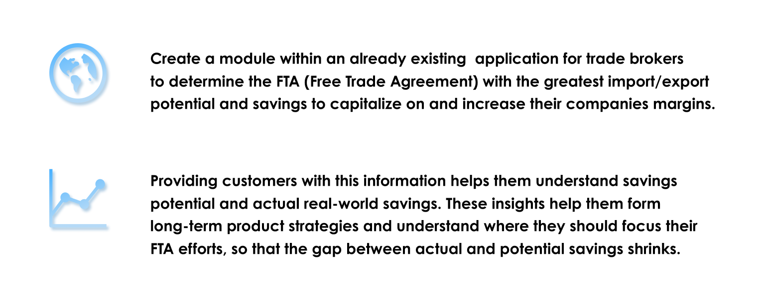
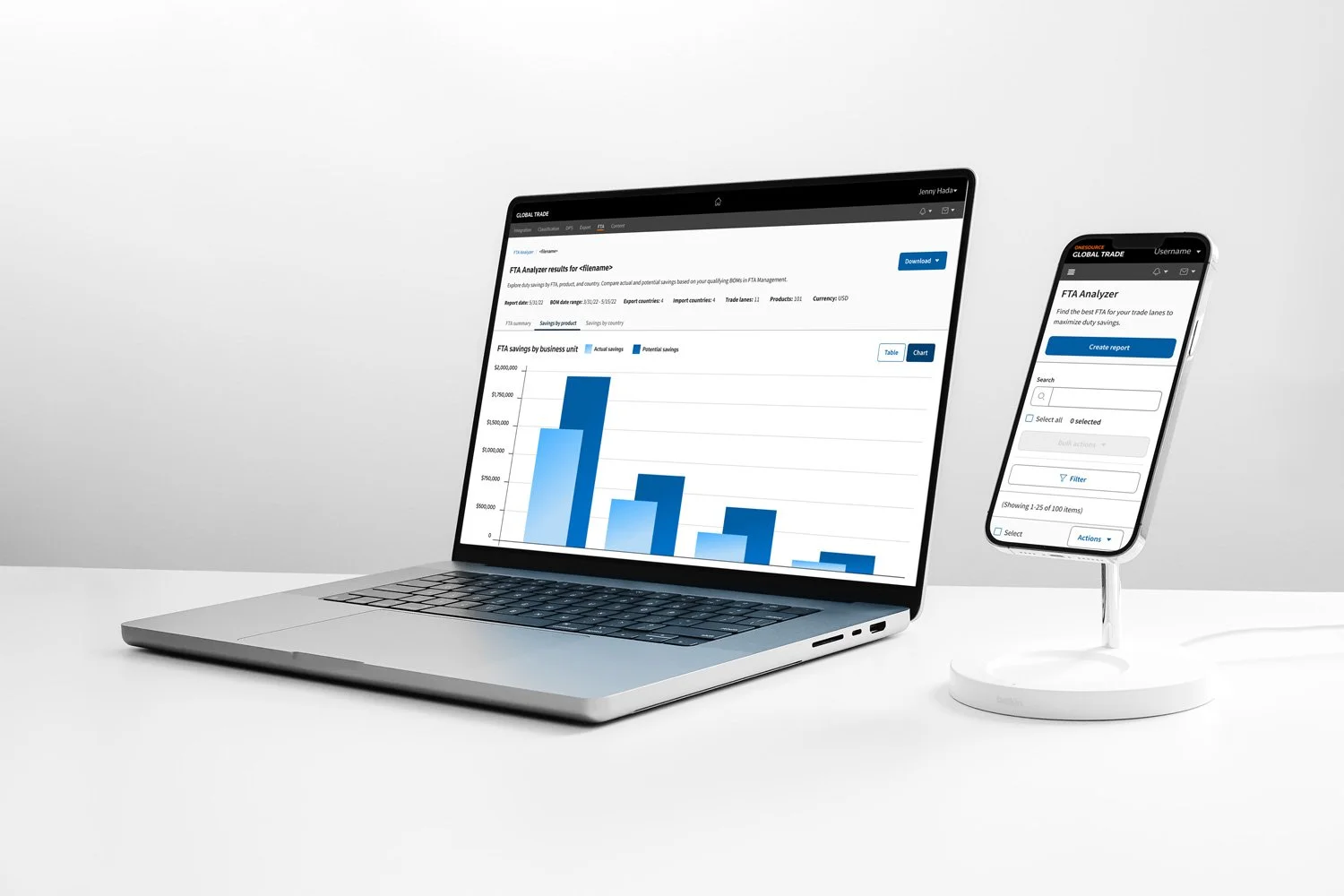
During my sophomore adventure at Thomson Reuters, I was responsible for creating design solutions and experiences for industry leading trade brokers. Working closely with a robust international team, my aim was to deliver a product to aid consumers in their trading decisions and capitalize on their “Actual” and “Potential” savings.
FTA “Free Trade Agreement” Goals
Don’t reinvent the wheel
As a global trade professional, I need to assess the difference between actual and potential free trade agreement (FTA) savings for my products when formulating trade strategies, so I can optimize my supply chain, reduce duty spend, and increase company profit margins.
- FTA Analyzer Problem Statement
Performing both a cognitive walkthrough and a contextual inquiry we were able to determine distinct flows of interactions for our intended users. An intake document was formulated to define a problem statement, state assumptions of our users or existing customer insights, user values or use cases, and expected outcomes.
-
• Where steps may fail or succeed for first-time or infrequent users
• Environment of intended use
• Underlying work structures that support work to be done.
-
• Process of finding the FTA module
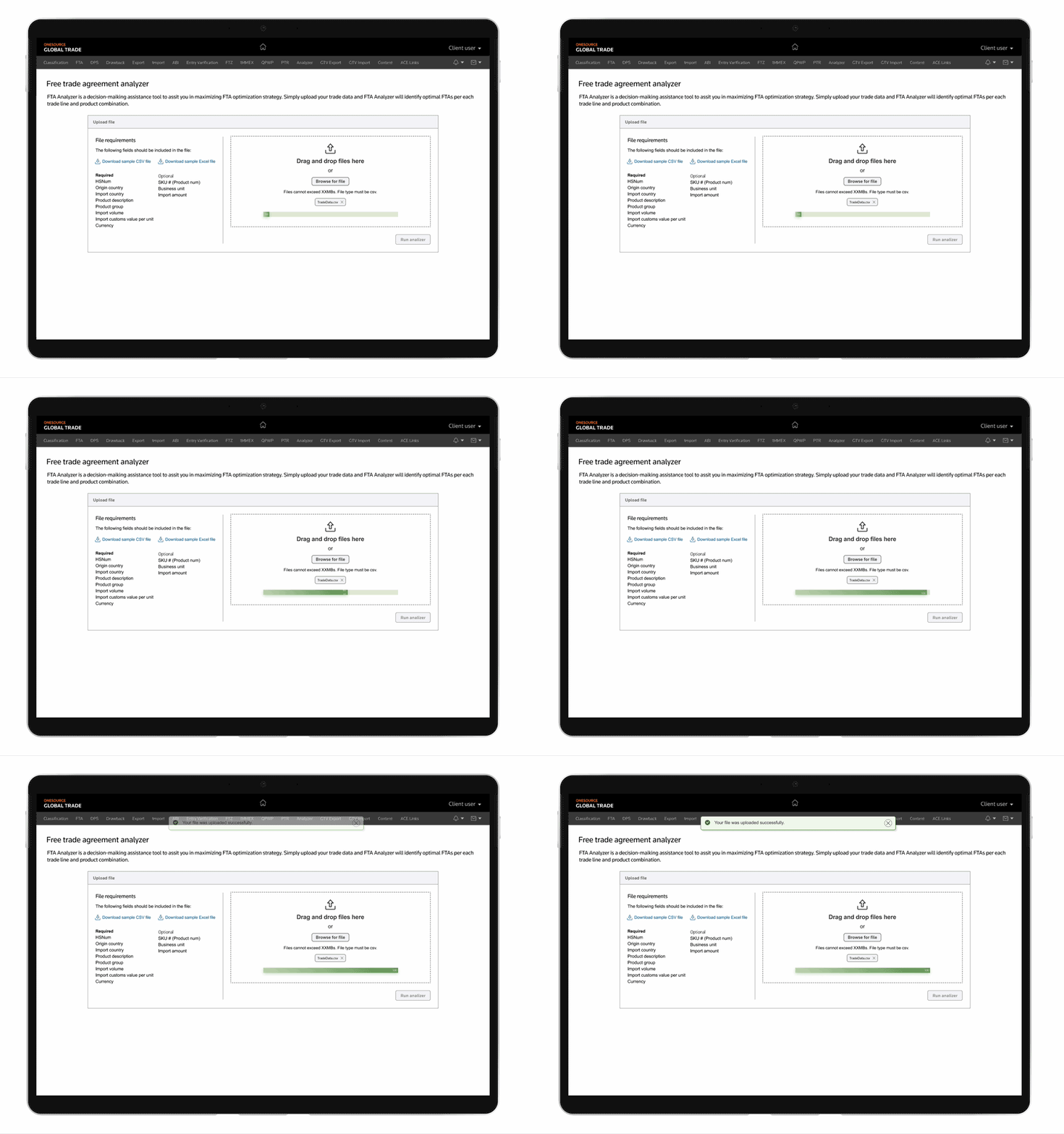
• Upload process
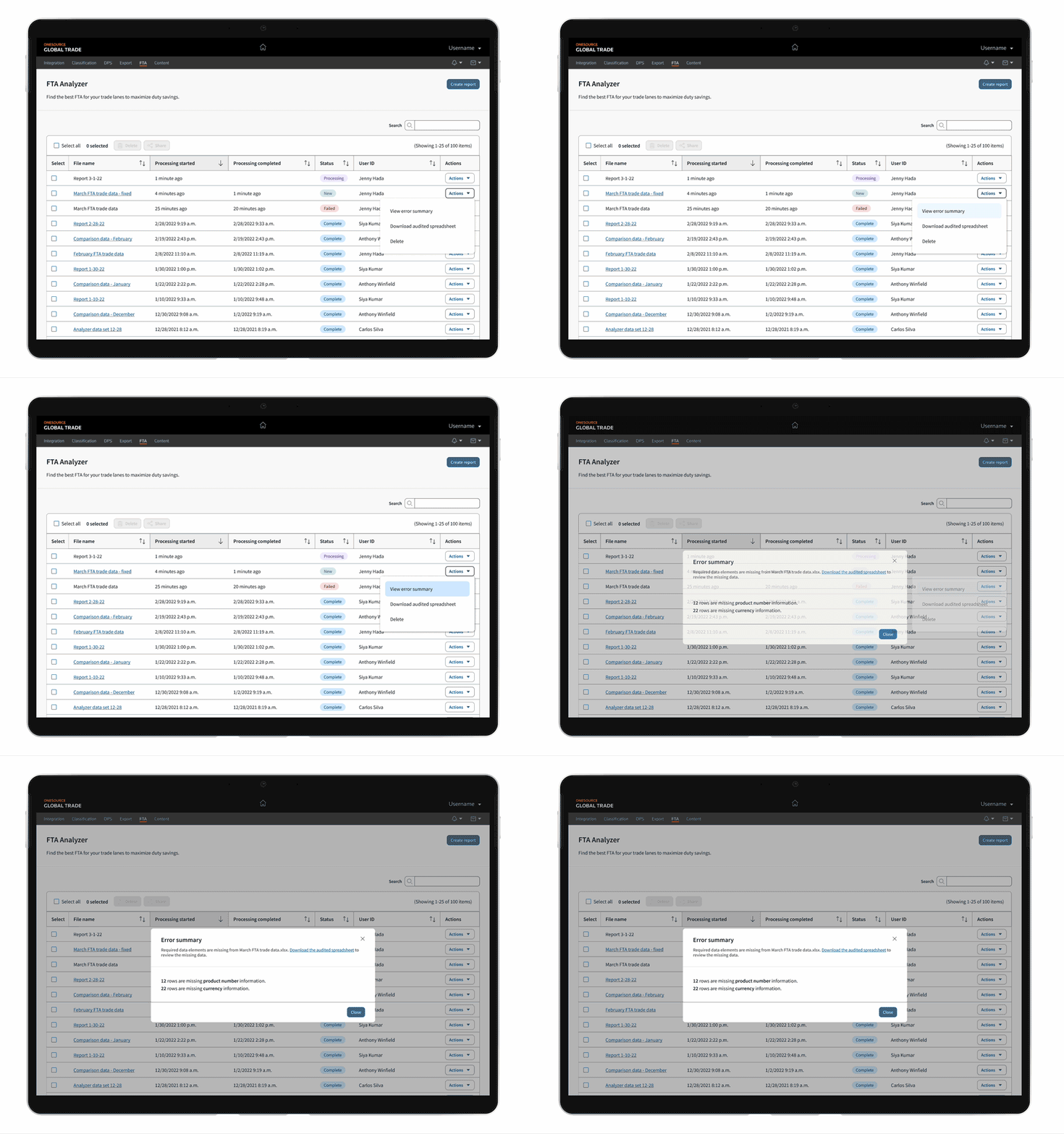
• User dashboard
• All error and success states and corresponding messaging
• FTA reports
• Interactions a user would take with each step
Phase 1 FTA User Flow
• User can select which FTA to use
• User upload trade data into the system
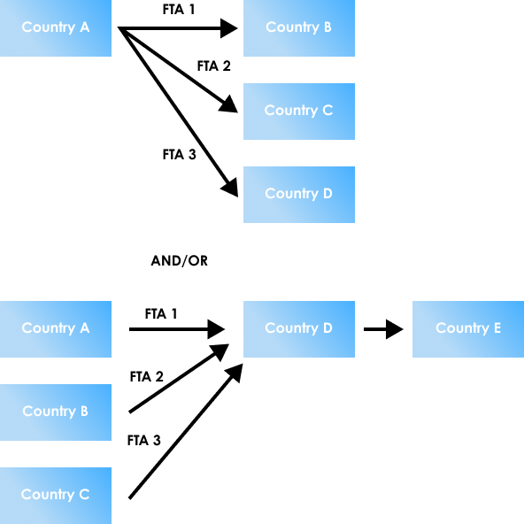
• System maps the country to country pair based on uploaded trade data
• Per each country pair, check if FTA existsIf FTA(s) exist, compare tariffs
• Calculate potential savings
• Generate a FTAs list, for example, top 5 FTAs, the company can enjoy
one step forward, two steps back
Initial testing with users were quite favorable, gaining incredibly valuable insights on the trade industry as well as what types of tools industry user needed most. Assumptions of users wanting to use this on larger devices had proven to be right, as did the desire to have savings separated into distinct pages (Summary, Product, and Country). Inclusive and digestible language as well as current asset libraries were greater challenges.
Phase 2 FTA User Flow
If potential savings are same, i.e. FTA tariff is same, compare the Rules of Origin to check which one is “easier”
Key fields: Export, import country, HS code, trade amount per product
Potential savings = (Regular tariff – FTA presidential tariff) X trade amount
User can select which Country they will export based on FTA benefit
User can select which Country they should source components
This could be used for intelligent supplier solicitation
Through affinity diagramming we were able to synthesize our data into actionable design tasks. Working closely with our product team based in Seoul, we felt that we had something that was close to what we had initially been asked to create. However, after QA testing with our developers, a new challenge of displaying “Actual” vs “Potential” savings surfaced.
“Actual” vs “Potential”
“Actual” vs “Potential” savings became the primary focus of myself and my content specialist, proving to be our biggest challenge and biggest success. Something both our stakeholders as well as users championed. Many participants said this was exactly the functionality they had been waiting for years.
-
• Actions for users to view error summaries
• Downloading Capabilities:
- Error reports
- Source data
- Report itself• Both types of savings were now always visible to users, indicated indicated by color and a corresponding key
• Users select which FTA they would like to use and be shown the unclaimed savings
